Guide
Chroma Key Background Remover
Short answer: a chroma key removes one colour, so the colour you choose only has to do one job — be absent from everything you want to keep. That makes green the sensible default (digital cameras resolve green detail best), blue the correct switch when the subject itself carries green, and any other flat colour a perfectly valid answer when neither is available. The expensive mistake is not choosing the wrong colour; it is clicking in the wrong place to sample it. Read the two sections on clicking before you re-shoot anything.
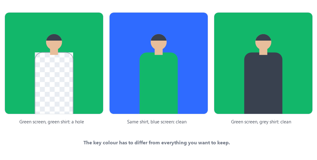
What the key colour actually decides
When you click the eyedropper on a colour, you are not telling the tool "this is the background". You are telling it "this is the colour I want deleted". Everything within the tolerance radius of that colour becomes transparent, wherever it appears in the frame — including on the subject. Everything outside the radius is kept, including parts of the background that lighting has pushed away from the colour you sampled.
That single sentence explains almost every complaint about chroma keying. The tool has no idea which pixels are "background"; it only knows distance from the colour you picked. So the question is never "which colour is the background", it is which colour does the least damage inside the subject.
Why green is the default
Two reasons, and only the first one is about colour at all:
- Sensor resolution. Most digital camera sensors use a colour filter array with twice as many green photosites as red or blue. In practice that means a green edge carries more recorded detail per pixel than a blue one, so hair and thin edges survive keying slightly better against green.
- Luminance. In the luma calculation, green contributes roughly 0.7 of the brightness signal while blue contributes around 0.1. A green screen therefore reads as a bright screen — it lights the subject and throws usable detail onto it, while a blue screen leaves shadows that are harder to lift. This is an explanation of why the convention settled on green, not a rule you have to obey.
Neither point is a reason to force green onto a subject that contains it. Both are reasons to prefer green when you have a free choice.
When blue is the better key
Switch to blue when green already means something in your frame. Work down this list and stop at the first line that is true:
- The wardrobe. A green shirt, a green jacket, a green logo on a grey hoodie, green laces. Anything a viewer would notice if it vanished.
- The product. Packaging, labels, plants, food, a green-lit device screen. Product shots are where this bites hardest, because a hole in the product is not fixable in post.
- The environment you cannot move. Shooting on grass, in front of planting, or in a room with a green wall that ends up in frame.
- Hair or skin with strong green cast. Rare, but under green-dominant lighting a subject can drift close enough to the screen colour that tolerance starts eating the edge.
Blue also wins for subjects that are themselves blue-light or cyan-heavy, and it is the traditional choice for very dark subjects, because a deep blue screen reads closer to black in luminance and stops the spill from reading as a bright halo.
When neither green nor blue is right
Contrary to how the technique is usually taught, nothing requires the screen to be green or blue. The requirement is that the colour is flat, evenly lit, and not present in the subject. A grey backdrop, a magenta one, or a saturated orange one all work with the same maths this page uses, because the tool is comparing chroma distance, not looking for "green".
Two situations push you outside the two standard colours:
- The subject contains both green and blue — a green top with denim, or a product shot with both colours. Pick a third colour that is absent from the shot and use that.
- You have no screen at all, just a plain wall. If the wall is one flat colour, brighter or darker than the subject, it can be keyed. It will be a rougher key than a proper screen because paint is never as even as fabric, but "we have a grey wall and it works" is a real answer.
What does not work is a scene with no flat colour region at all: an outdoor shot, a textured wall, a patterned background. A chroma key cannot invent a separation the photo never contained. If you see no candidate colour anywhere in the frame, you are looking at the wrong tool, not the wrong setting.
Where you click is the part people get wrong
Given one screen and one subject, the single decision that changes the result most is not green versus blue. It is which pixel you sample.
- Click the middle of a flat area, never a hot spot. Screens are lit, and lit screens have bright spots. Sample the brightest part and the tool deletes a colour that almost nothing else in the frame matches, so the background survives with ugly patches. Sample the middle of the screen's average tone instead.
- If the screen has a gradient, sample the darkest end and the brightest end in turn. Watch which one leaves less background behind. A screen that falls off toward the edges will always be a compromise — that is a lighting problem, and the honest fix is a second light, not a slider.
- Never sample the subject's own edge. The pixels where person meets screen are a physical mixture of the two. Sampling there teaches the tool a colour that is half person, and it will start deleting skin.
- Re-click after any change to the lighting. If you moved a lamp, moved the subject, or the sun came out, the screen colour in the file has changed. Keeping the old key colour is a common way to get a result that "used to work".
A five-minute check before you re-shoot
Chroma keying is usually a decision about the shoot, not about the software. Before you set anything up again, confirm these three things from the file you already have:
- Is there a flat colour region anywhere in the frame? If yes, the photo can be keyed. If no, no tool will save it.
- Does the colour you intend to key appear on the subject? If yes, change the screen colour or change the wardrobe — in that order, because screens are easier to swap than people.
- Is the screen evenly lit? Hold a straight edge against the screen in your mind: if one side is visibly brighter, one tolerance setting cannot cover both ends. Fix the light, then key.
Questions people ask about key colours
- Can I use a colour that is not green or blue?
- Yes. Any flat, evenly lit colour that does not appear in the subject works. The tool compares how far each pixel sits from the colour you sampled, so the specific hue is irrelevant — what matters is that the screen is one colour and the subject is not.
- Is green always better than blue?
- No, and this is the most common piece of advice worth ignoring. Green carries more recorded detail and more luminance, which helps with hair and fine edges. It stops being the better choice the moment the subject contains green.
- Why does the background survive in patches when I click the screen?
- You almost certainly sampled a hot spot. The bright part of a lit screen is not the colour most of the screen actually is. Re-click in the middle of a flat area and watch how much of the background disappears.
- What if the screen looks fine to my eye but the cutout has a green rim?
- That is spill rather than a colour-choice problem: green light from the screen is landing on the subject, so those pixels are genuinely part green. Raising spill removal is the right control. The deeper fix is on set — move the subject further from the screen and light them separately.
- Can I key a wall instead of buying a screen?
- Often yes, if the wall is one flat colour and you light it evenly. Expect a rougher result than fabric: paint reflects unevenly and picks up shadows, so you will spend more time on tolerance and softness than you would with a proper screen.
- Does the colour I choose change the resolution or file size of the export?
- No. The key colour only decides which pixels become transparent. The export is still a PNG at the exact pixel size of the file you loaded.
Open the green screen remover — free, no signup, any key colour, and your image never leaves the browser. If the problem is not the colour but the frame itself, this guide covers the four things that break a key; if your transparent export keeps coming back with a white box, the answer is in which formats keep transparency.